
Client: Pyaar Care
Industry: Skincare / Wellness
Scope: Brand Identity & Packaging
Deliverables: Logo Design, Brand Guidelines, Packaging Design
Overview
Pyaar Care is a 100% natural skincare brand built on emotional warmth and botanical purity. The identity balances the depth of the word Pyaar (“love”) with a trustworthy, clean aesthetic to cut through a crowded natural beauty market.
Execution & Impact
Delivered a complete visual brand system, from core strategy and logo design to unified brand guidelines and high-end packaging. The result is an authentic, memorable presence that bridges formulation purity with heartfelt connection across every customer touchpoint.
Challenge
We were tasked to develop a heartfelt and trustworthy brand identity for Pyaar Care, a skincare brand made with 100% natural ingredients.
The brand needed to capture both the purity of its formulations and the emotional warmth behind the name “Pyaar” (which means love), while standing out in a highly competitive natural skincare market.
Scope
- Brand discovery and strategy alignment
- Logo design that conveys purity, softness, luxury and love
- Brand guidelines to ensure visual consistency
- Packaging design that reflects clean beauty and shelf appeal
Brand Concept & Strategy
Brand Essence: Natural skincare made with love.
Pyaar Care celebrates rituals of self-love, conscious beauty, and transparency, with ingredients you can trust and packaging you’ll want to keep.
Tone of Voice:
Gentle, authentic, nurturing, grounded in nature, elevated by care.
Visual Inspiration:
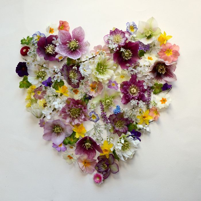
Earthy minimalism, botanical motifs, clean typography, soft color palettes inspired by nature.
Logo Design
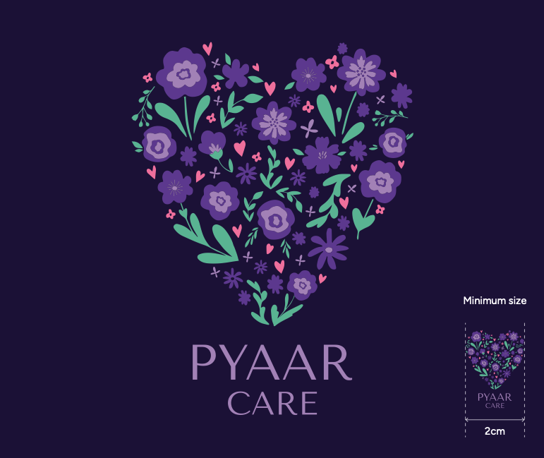
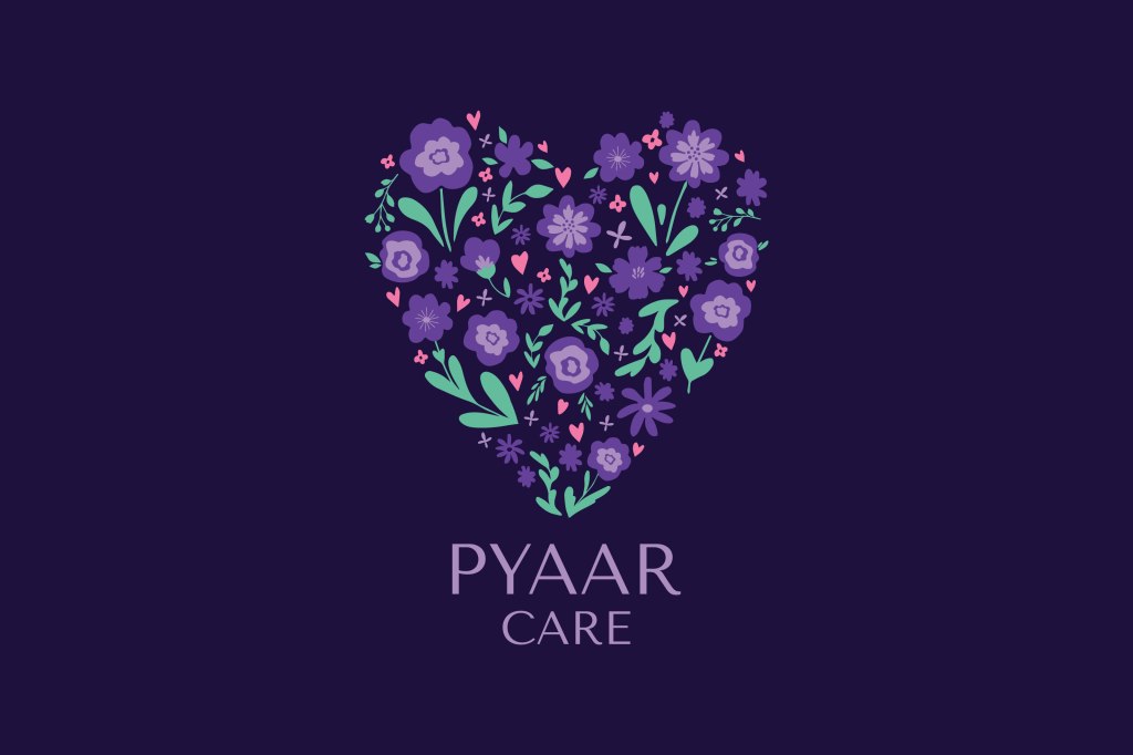
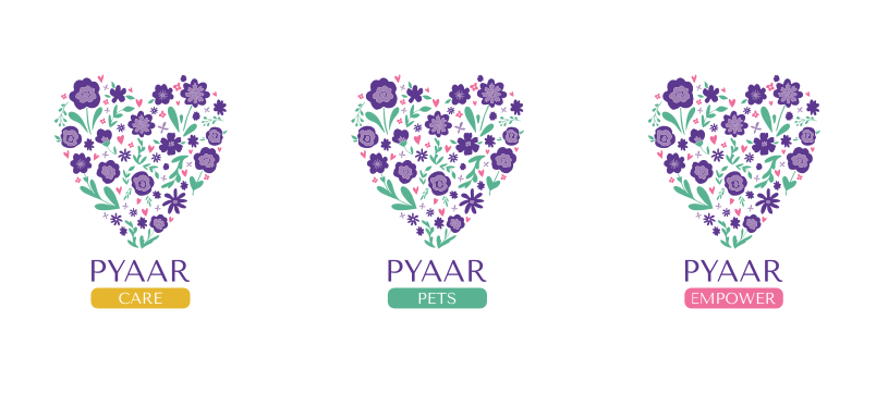
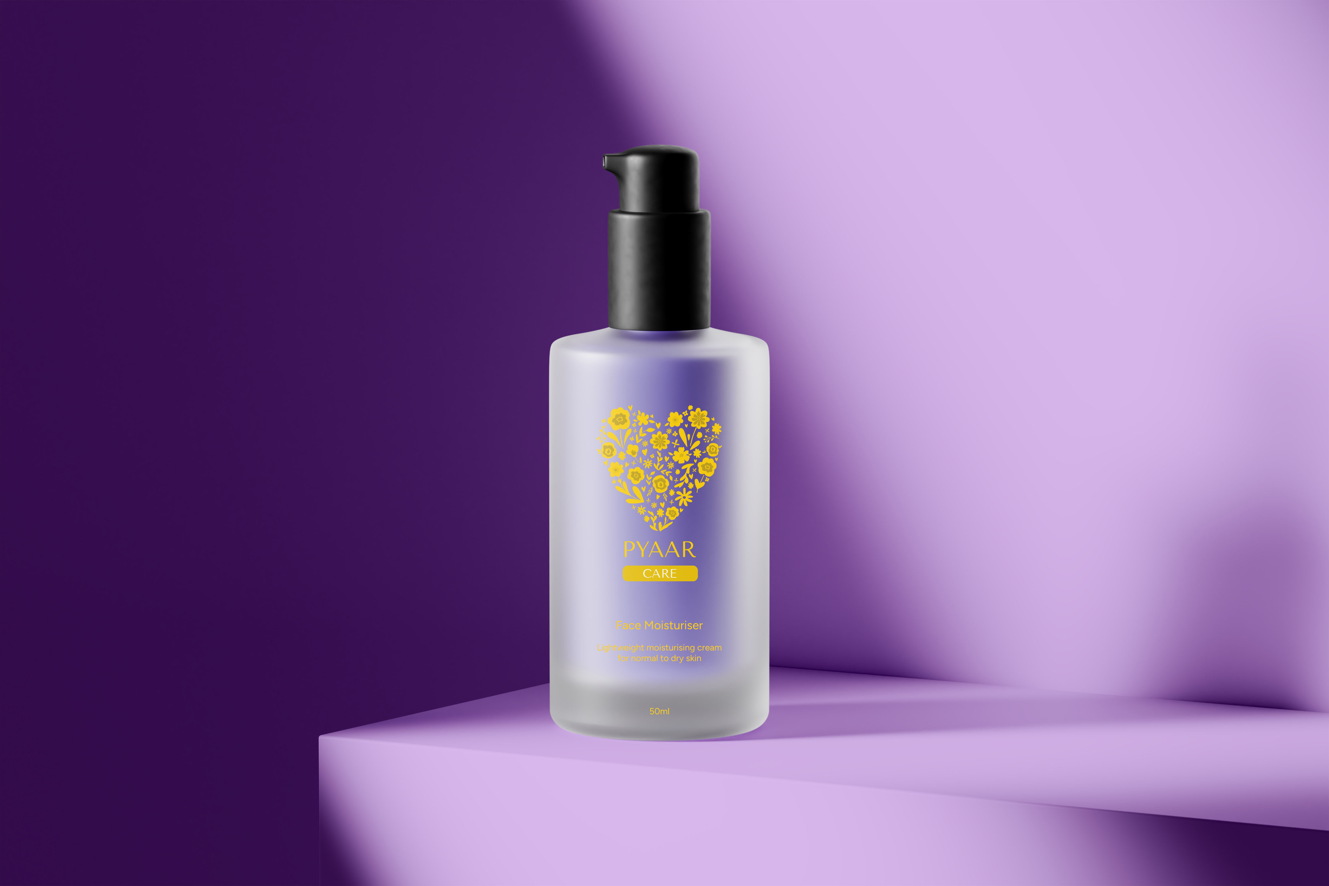
The logo is a blend of modern elegance and soft organic plant motifs, all arranged in a heart shape. The design symbolises the natural flow of skincare and the emotional foundation of the brand — love.
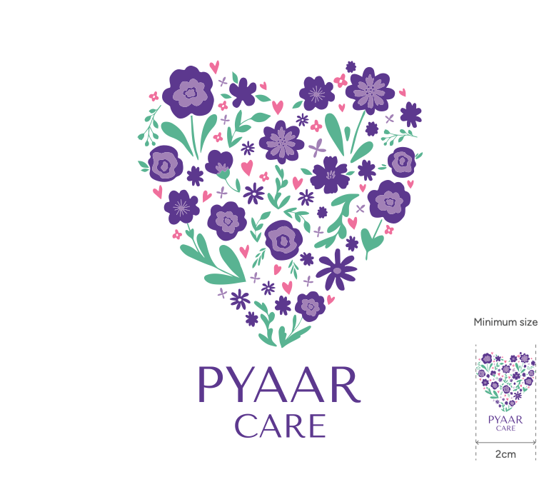
Designed to work on both digital platforms and small-format labels.
Brand Guidelines
I delivered a detailed brand system to ensure coherence across touchpoints:
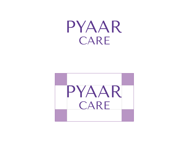
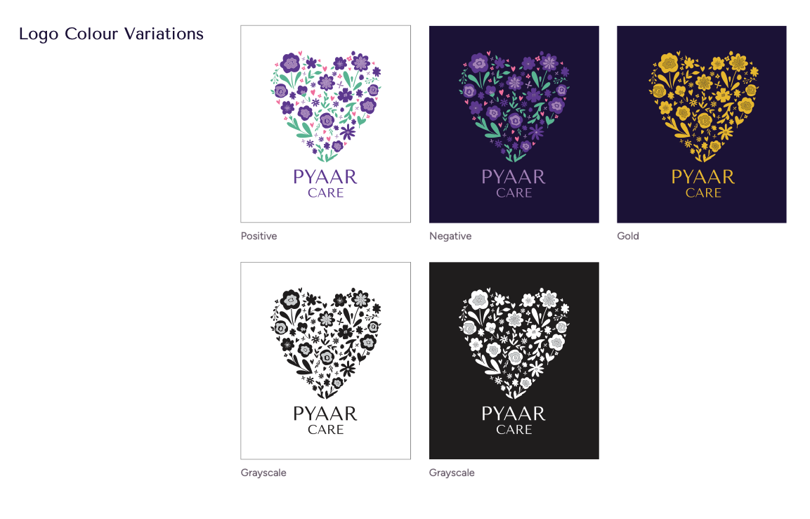
- Logo usage and variations
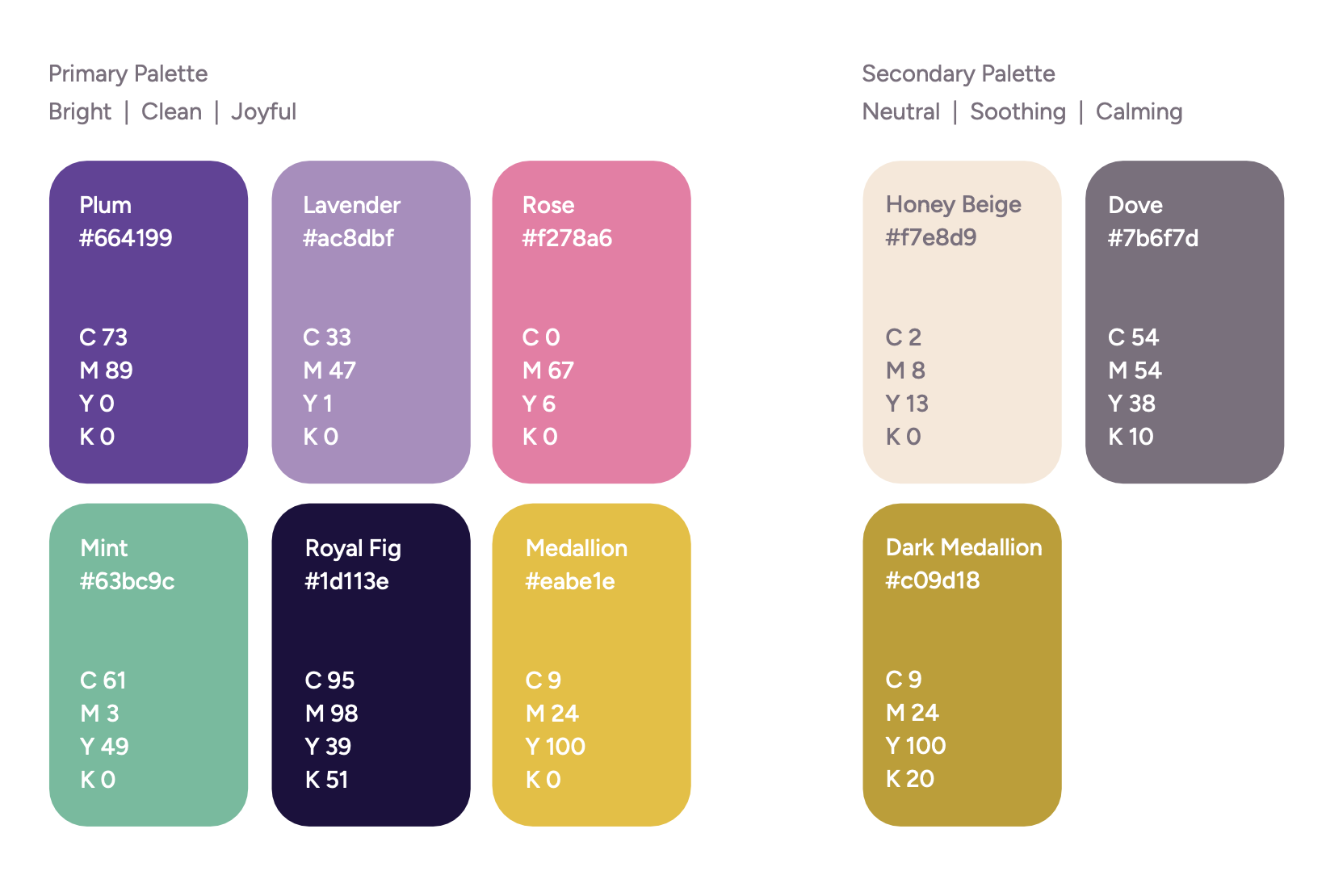
- Primary colour palette: Bright, clean and joyful
- Secondary colour palette: Neutral, soothing and calming
- Primary and secondary fonts balancing clarity and warmth
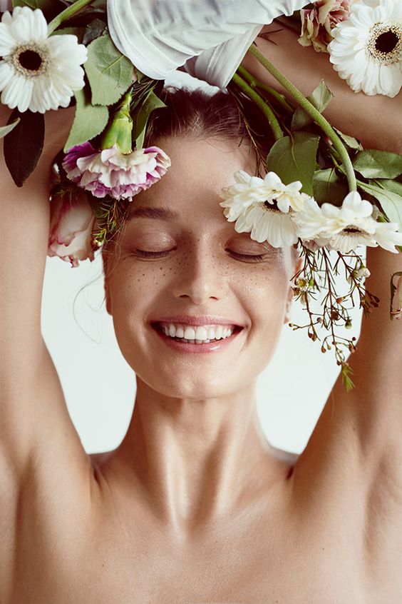
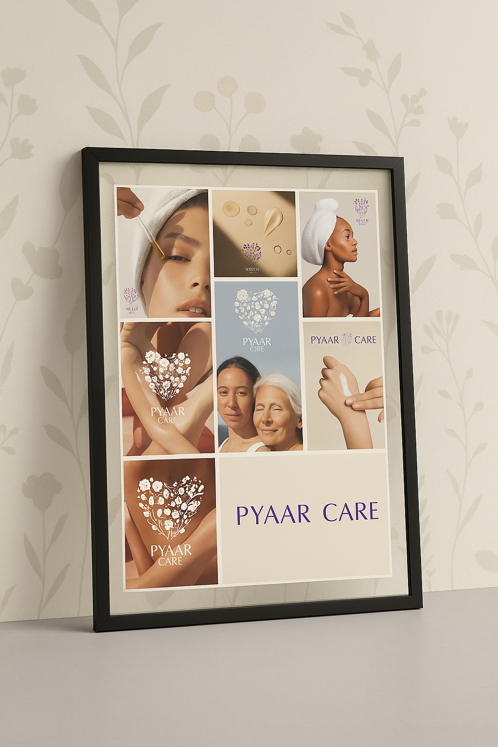
- Photography guidelines for product and lifestyle shots (natural light, bare skin, clean textures)
Packaging Design
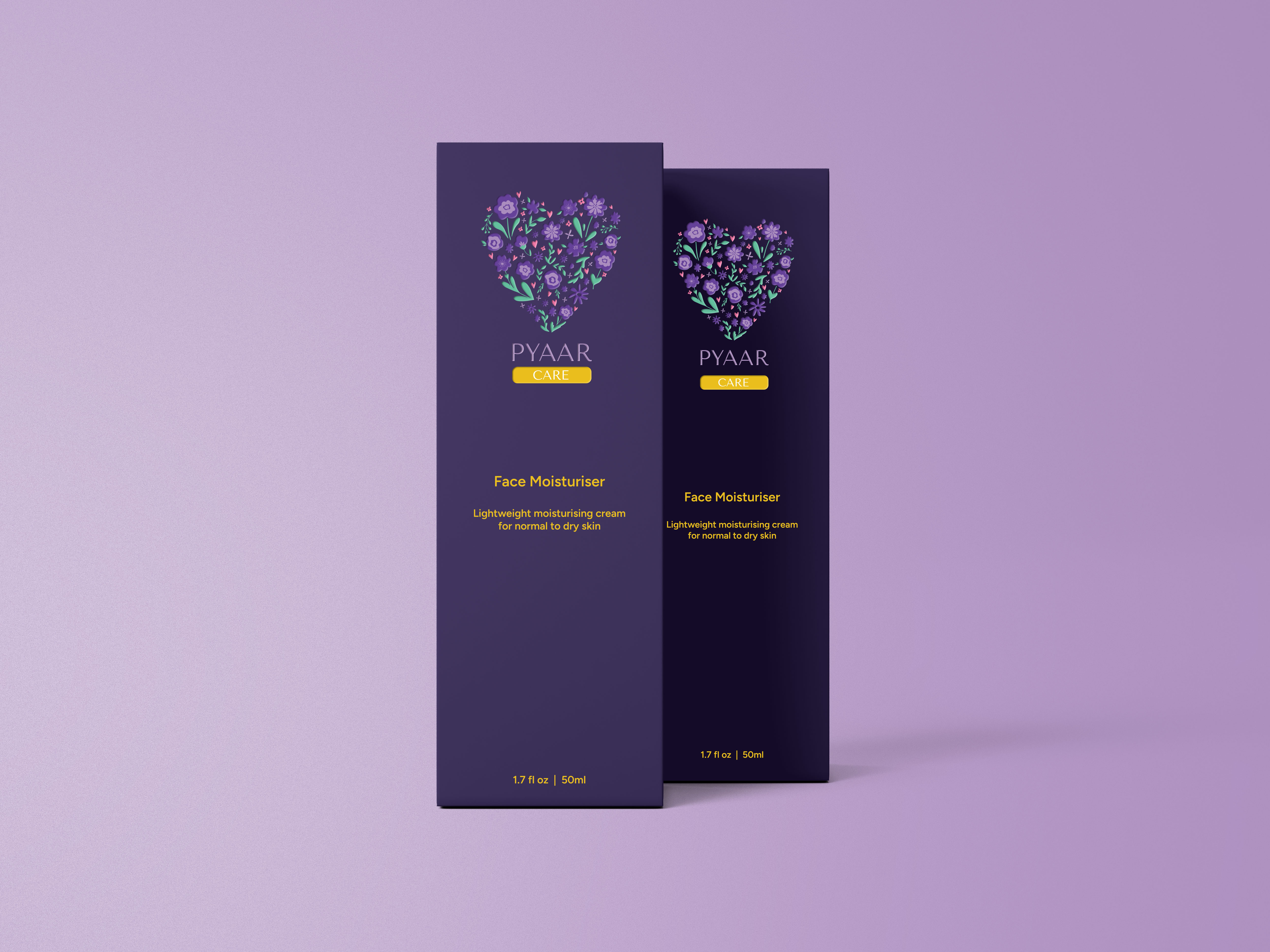
Packaging was designed to reflect purity, sustainability, and tactile appeal:
- Minimalist labels with matte finish and embossing on logo
- Recyclable glass bottles and boxes
My Role
Spearheaded end-to-end brand identity and packaging design for Pyaar Care, establishing a distinct visual positioning in the competitive 100% natural skincare market.
Translated brand values into a cohesive visual system, seamlessly pairing emotional warmth (Pyaar) with modern botanical purity.
Delivered full brand system assets, including brand strategy, logo lockups, comprehensive style guidelines, and retail-ready packaging design.
Reflection
This project was an opportunity to design a holistic brand system that bridges emotional storytelling with sustainable skincare.
By grounding every design decision in the values of transparency, love, and nature, Pyaar Care emerged as more than just a skincare line, it became a brand that cares.

 Gentle Lion
Leave a comment